Projects/VisitorList
Visitor List
Designing how people view & manage their visitors


OVERVIEW
Role
Product Designer (Sole designer)
Duration
3 months
Company
NoBrokerHood
Responsibilities
Information Architecture, Visual Design, Handoff
NoBrokerHood is the resident app of a visitor management platform used by ~15,000 gated communities in India. It works like a digital intercom: when a visitor arrives, the guard sends an approval notification to the flat. Once any resident approves, the guard lets them in and logs the entry.
Three kinds of visits flow through the system: walk-ins approved per visit, pre-approvals set up in advance, and daily help (maids, cooks) who enter with a passcode and don't need per-visit approval.
This project focuses on viewing and managing those entries.
OUTCOME
The Final Design
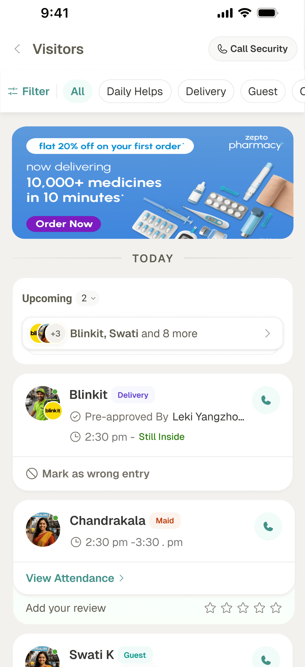
Old design
Redesign
Pre-approved visitors & group invites
Type dependent action row
Visitor type filters
Ad space
Chronological Order
Call security button
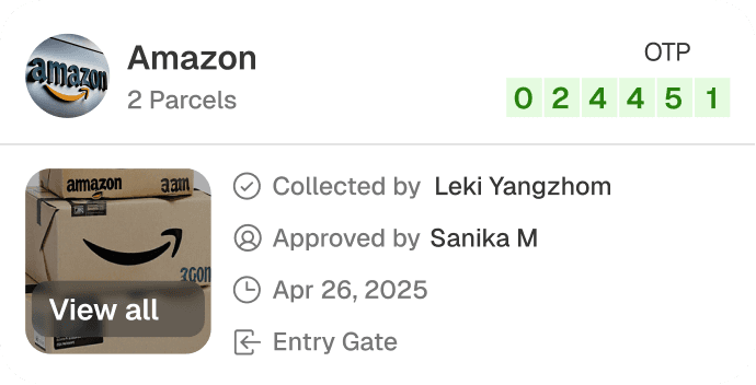
The shipped design covers edge cases — live group invites, pre-approved entries, partially picked-up packages — and is now live in 200 societies.
The Process
Approach
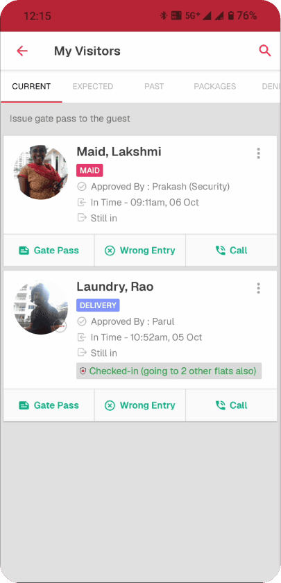
In the old design, all visitors were segregated by their visit status.
Click data showed nearly half the users who landed on the Current tab immediately switched to Expected, a sign the default view didn't match their intent. Most were searching for a specific visitor, and the tabbed format worked against both behaviours.
Grouping
In the old design, all visitors were segregated by their visit status.
My visitor
Current
Expected
Past
Packages
Denied
Old design
Visitors inside the society
Pre-approved visitors
Visitors who’ve exited
Delivery packages left with security
Entries denied by resident
Testing with paper Paper prototypes
I sketched four directions and tested with six people in the office.
I found that
Separate daily help section was preferred by all
A single chronological list was easier to parse than tabbed one
Filter chips worked better than hidden filters.
A
B
C
D
My visitor
Regulars
Current
Past
Expected
All
Delivery
Guest
Cab
Packages
My visitor
Daily help (Regular helpers like cook or maid)
Visitor pre-approved for frequent visits
First version (V1)
V1 used the patterns testing surfaced: a separate Daily Help section, a chronological visitor list, visible filter chips.
Stakeholders pushed back on the separate Daily Help section because it broke parity with how the homepage already surfaces helpers. I took the input and continued in a slightly different direction.
Daily help
Add Help

MAID
Chandrakala
Inside
|
11:30am
Attendance

COOK
Sushmita
Left
|
02:00pm
Attendance


Instant Help
In 10 mins
Book
Full Home, Sofa
Bathroom Kitchen
Cleaning Services
Get Professional

VISITORS
Today
Delivery
Guest
Cab
Packages

Swati Kushwaha
INSIDE
Pre-approved by - Parul Gupta
2:30 pm
Edit Invite
Call


Blinkit Delivery
LEFT
R Rajakumar
2:30 pm - 3:30 pm
Wrong Entry
Call
Blinkit Delivery
LEFT
Visitor - R Rajakumar
Number - 919376268
Copy
Approved by - Parul Gupta
In Time - 2:30 pm, 2nd Oct
Out Time - 3:30 pm, 2nd Oct
Wrong Entry
Call
Yesterday

Blinkit Delivery
Call
22 Sep 2025
Blinkit Delivery
Call
Blinkit Delivery
Call
Visitors
9:41
V1
Date & Visitor type filters
Cross-sell - NoBroker home services (cleaning, etc.)
Daily help cards to show regardless of visit status
Explored, didn't ship: entry overview
One way to keep daily help visible without a dedicated section was an overview row of all entry types like daily helps, pre-approvals, group invites, auto-approvals above the list.
I scrapped it. The overview added density without serving the primary task. Rams: good design is as little design as possible.
Daily Help

pre-approvals


+3
Auto-approved
+3
TODAY

MAID
Chandrakala, Maid
INSIDE
2:30pm
View Attendance


Blinkit Delivery
INSIDE
Approved By
Swati
|
2:30pm
View Visit

PRIVATE
Uber
LEFT
Approved By
Amrita
|
2:30pm - 4:57
View more
YESTERDAY
PRIVATE
Uber
LEFT
Approved By
Amrita
|
2:30pm - 4:57
See more
PRIVATE
Uber
LEFT
Approved By
Amrita
|
2:30pm - 4:57
See more
All
Guest
Cab
Other
Packages
Visitors
A
B
Daily Helps

Chandrak ...
Add more
Expected Visitors
Pre-approve

+3
View all
Auto-approve Entry
Allow all entries from
swiggy,
zomato &
blinkit
TODAY
MAID
Chandrakala, Maid
INSIDE
2:30pm
View Attendance
Blinkit Delivery
INSIDE
Approved By
Swati
|
2:30pm
View Visit
PRIVATE
Uber
LEFT
Approved By
Amrita
|
2:30pm - 4:57
View more

YESTERDAY
PRIVATE
Uber
LEFT
Approved By
Amrita
|
2:30pm - 4:57
See more
PRIVATE
Uber
LEFT
Approved By
Amrita
|
2:30pm - 4:57
See more
All
Guest
Cab
Other
Packages
Visitors
Early testing
I re-tested the cards by asking participants to find a detail hidden in the expanded view. Three things broke:


Blinkit Delivery
INSIDE
R Rajakumar
2:30 pm
Wrong Entry
Call
Wrong Entry felt overweighted. Participants assumed it triggered an action; it only flags the entry, with no backend or security workflow.
The Call button was ambiguous and a few asked whether it called the visitor or the guard.
The expand affordance wasn't obvious, a few participants didn't recognise the chevron as expandable.
Card anatomy
The card design went through a few iterations before we settled on a design that could work for all cards.
In the final design, I made some key changes -
Moved the entry status to the entry-exit time row.
Added back the category tag for easy scanning
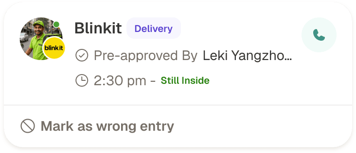
The profile picture has an accompanying company logo for recognisability.
Old design


Blinkit Delivery
INSIDE
R Rajakumar
2:30 pm
Wrong Entry
Call
Card expands to show details
‘Give Feedback’ removed due to its lack of usage and utility
Entry status highlighted


Blinkit
DELIVERY
INSIDE
Pre-approved By
Leki Yangzhom
2:30 pm
View Visit

Blinkit
Delivery
Pre-approved By
Leki Yangzhom
2:30 pm -
Still Inside
Mark as wrong entry
Final Design
Bottom sheet for scalability
Approval information - consistent across all card types
Status placed with context - entry/exit data
Visit category
Daily help card
There are four actions a user can take on a daily help card.
Go to profile page to view attendance
Call the daily help
Add review(if not given alreadu)
Issue gate pass (only if daily help is inside te society)

Chandrakala
MAID
2:30 pm - 3:30 pm
+2
A-102, A 103
+1
Issue Item Pass
Call
Add your review
Add your review
Chandrakala
MAID
2:30 pm -
Still Inside
Gate Pass
View Details
Chandrakala
MAID
INSIDE
2:30 pm
View Attendance
Issue Item Pass
Item pass will allow your daily help to carry things given by you outside the gate
Add your review

Add your review
Chandrakala
Maid
2:30 pm -
Still Inside
View Attendance
Gate Pass
Add review as part of the card
Opens profile page with attendance
Final design
Joining date & flat details
Text explaining feature
(Early testing showed ‘gate pass’ isn’t intuitive terminology
Detail view
There are four actions a user can take on a daily help card.
Go to profile page to view attendance
Call the daily help
Add review(if not given alreadu)
Issue gate pass (only if daily help is inside te society)


Blinkit Delivery
EXPECTED
Visitor
Rajkumar
987654321
Copy
In time
2:30 pm
Out time
2:30 pm
Approved By
Leki Yangzhom
Wrong Entry
Call
Approval information
Action row
Visit information

Rajkumar
CAB
987654321
Company
Uber
Cab number
2354
Pre-approved By Leki Yangzhom
In time
2:30 pm
Out time
Still Inside
Did not receive notification?
Know more
Mark as wrong Entry
Separate Profile card
Rajkumar
CAB
Number
987654321
Company
Uber
Cab number
2354
Pre-approved By Leki Yangzhom
In time
2:30 pm
Out time
Still Inside
Did not receive notification?
Know more
Wrong Entry
Separate contact row
Final design

Rajiv S
Delivery
Company
Blinkit
Phone
987654321
Approved By
Leki Yangzhom
In time
2:30 pm
Out time
Still Inside
Entry Gate
Gate A
Exit Gate
-
Did not receive notification?
Know more
Wrong Entry
Call
Action row
Name of the visitor
DESIGN DETAILS
The old design highlighted visitor type. Removing the tabular format meant losing the implicit status cue, so I introduced a status tag on the card itself and renamed visitors using a convention common to a couple of competitors.
Card Anatomy
Daily Help
Delivery
Cab
Guest
Group Invite
Packages
Private entry
Only visible to you

Title
Visit type
Pre-approved By
Leki Yangzhom
2:30 pm -
Still Inside
Mark as wrong entry

Visitor photo/company/type
Company/Name of visitor
Delivery
Guest
Cab
Maid
Group
Carpenter
Cook
Nanny
Tution
Visitor type tag
Call visitor(if number is available)
Approved/pre-approved by data
Entry/exit time
Share passcode
Re-invite
View Attendance
Visit type dependent Button

Add your review
Visit Pass
Requested on 4th may
Type of pre-approval
Filtering visitors
Two filter dimensions matter:
visit type (daily help, guest, delivery, cab, group, packages) and status (inside, expected, left).
Tags (private entry, marked as wrong, denied) contained a group of visit
I then moved the date filter into the same modal. One screen, one mental model so users see what they're filtering for in a single pass.
Date
24/04/26 - 05/05/26
Last 7 days
Last 30 days
Last 60 days
Sun
Mon
Tue
Wed
Thu
Fri
Sat
Apr 2022
30
31
1
2
3
4
5
6
7
8
9
10
11
12
13
14
15
16
17
18
19
20
21
22
23
24
25
26
27
28
29
30
1
2
3
May 2026
30
31
1
2
3
5
6
7
8
9
10
11
12
13
14
15
16
17
18
19
20
21
22
23
24
25
26
27
28
29
30
1
2
3
Done
Filters
Visit Type
Daily Help
Guest
Delivery
Cab
Group
Packages
Other
Visit Date
Last 7 days
Status
Inside
Expected
Left
Tags
Private entry
Marked as wrong
Denied
Only private entries made by you will be visible
Clear all
Show Results
Closing reflection
This project was unique in the sense that it involved designing something without a set goal that can be clearly measured by our current infrastructure. With limited data and insight into user’s mental models, this design is based on principles of progressive disclosure and
